
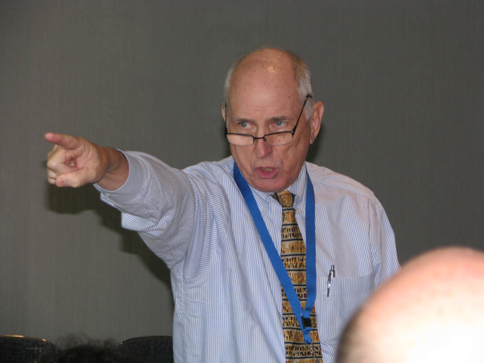
 Ed Henninger (photo courtesy Stan Schwartz, NNA) challenged publishers to add some design spice to their public notices during his speech at PNRC’s Best Practices conference on Sept. 22 in Franklin, Tenn. “If you make public notices difficult to read and treat them like an afterthought, nobody is going to look at them,” he said. Henninger followed with a humorous, rapid-fire presentation offering the following ideas:
- Use a visual header in the public notice section (e.g., photo of the local courthouse)
- Publish the contact information of public notice personnel
- Use headlines to break up groups of public notices
- Make lengthy notices more readable with columns and/or subheads
- For auction notices, include photos of the items to be auctioned
- Make public notices look like news, because that’s what they are
- Publish a map to identify locations of the events promoted in the public notice section
- Publish an index of public notice ads on the front page and/or in the public notice section
- Provide the web address for each notice published in your paper
- Publish old-timey photos in the public notice section (“People love old-timey photos”)
- Include a “why public notices are important” statement in the public notice section
- Add a glossary of public notice terms on the public notice page
Henninger offered to redesign public notices for free for the first publisher who called him after the conference. He also mentioned his grant program that helps to make redesigns affordable for newspapers with limited revenue.