
 Most public notices look like classified ads — an undifferentiated mass of agate type, designed primarily for goal-directed readers.
The public notices in Kentucky’s Georgetown News-Graphic are different. They look like news stories (PDF), designed to capture readers’ attention and promote the kind of serendipity that distinguishes newsprint from electronic formats. News-Graphic Publisher Mike Scogin (photo on left) decided to make this change about a year ago, after reading an issue of a newsletter distributed by newspaper-design consultant Ed Henninger.
Henninger Presents Public Notice Design Tips at Conference
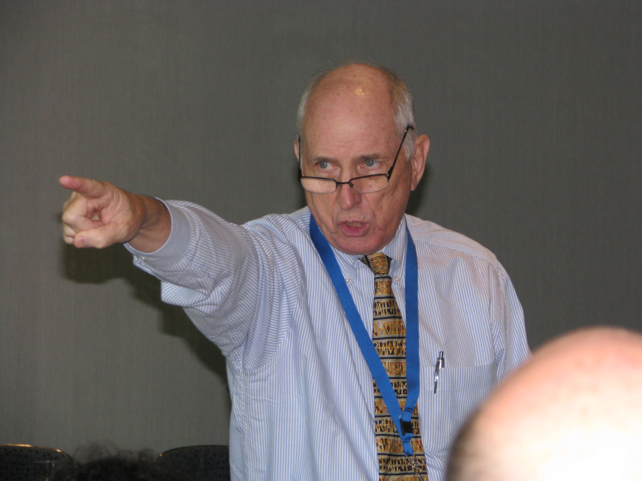 Ed Henninger (photo courtesy Stan Schwartz, NNA) challenged publishers to add some design spice to their public notices during his speech at PNRC’s Best Practices conference on Sept. 22 in Franklin, Tenn. “If you make public notices difficult to read and treat them like an afterthought, nobody is going to look at them,” he said. Henninger followed with a humorous, rapid-fire presentation offering the following ideas:
- Use a visual header in the public notice section (e.g., photo of the local courthouse)
- Publish the contact information of public notice personnel
- Use headlines to break up groups of public notices